
Boutique Packaging for Coloured Contact Lenses
____________true tint
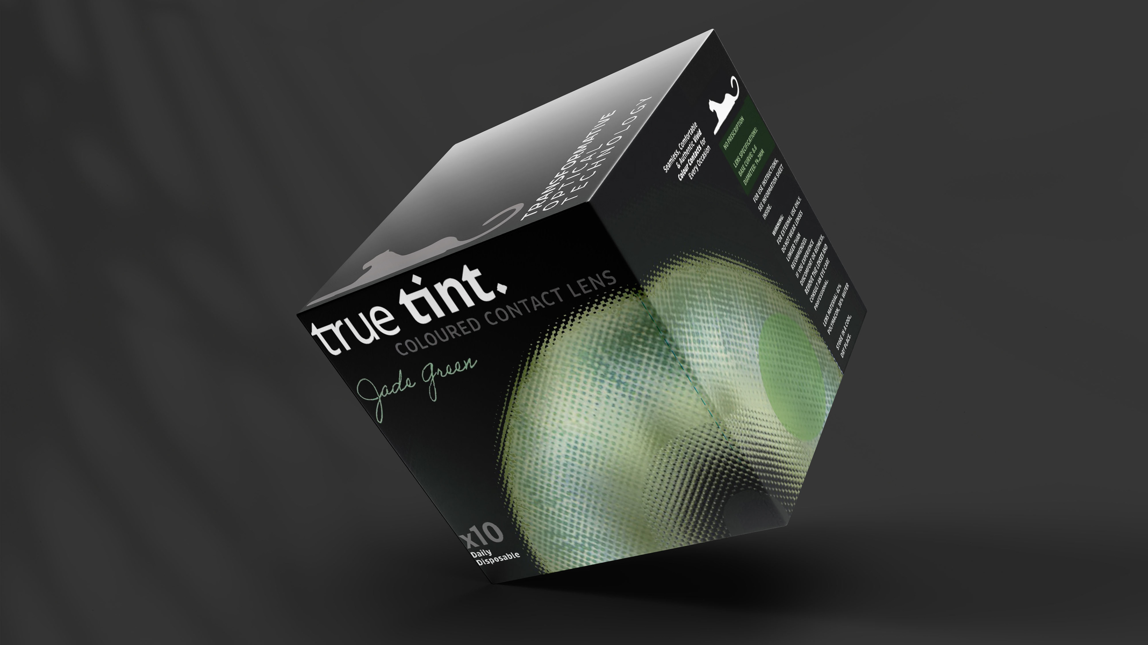
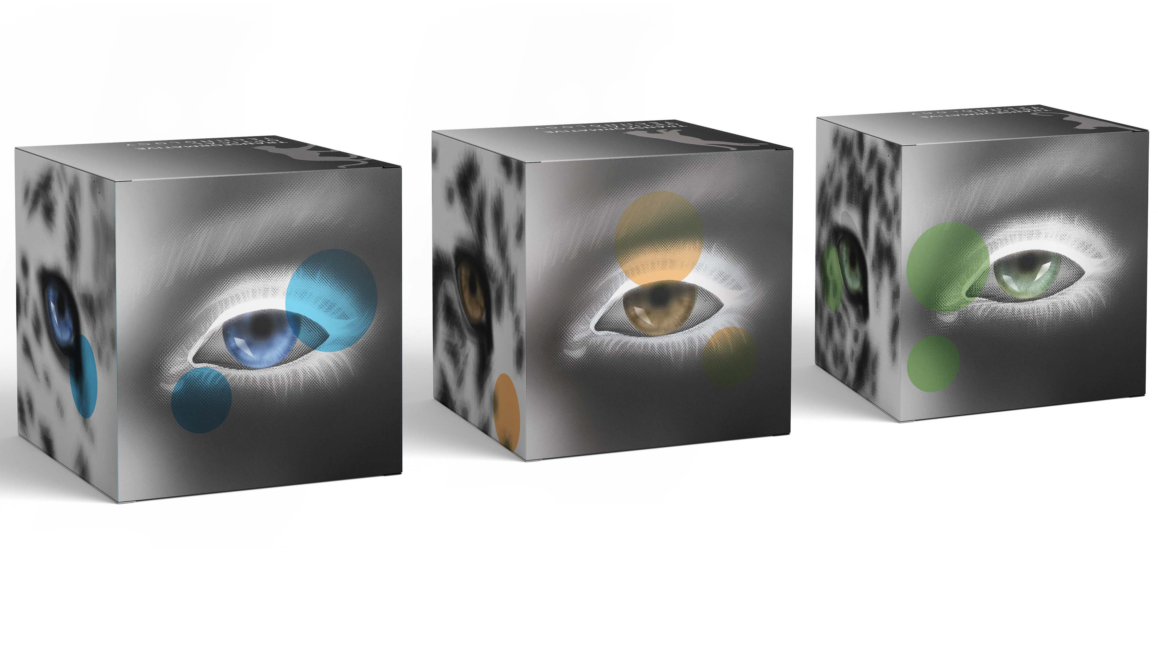
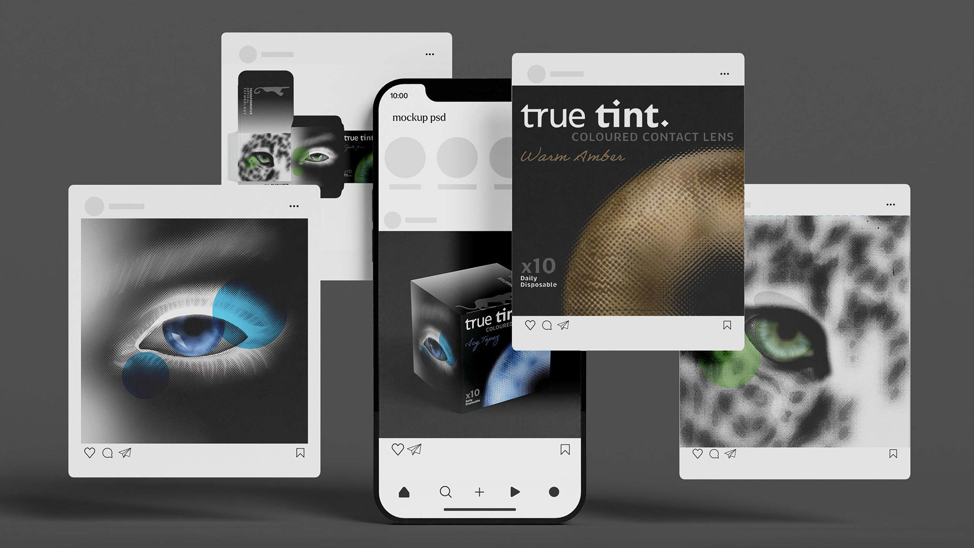
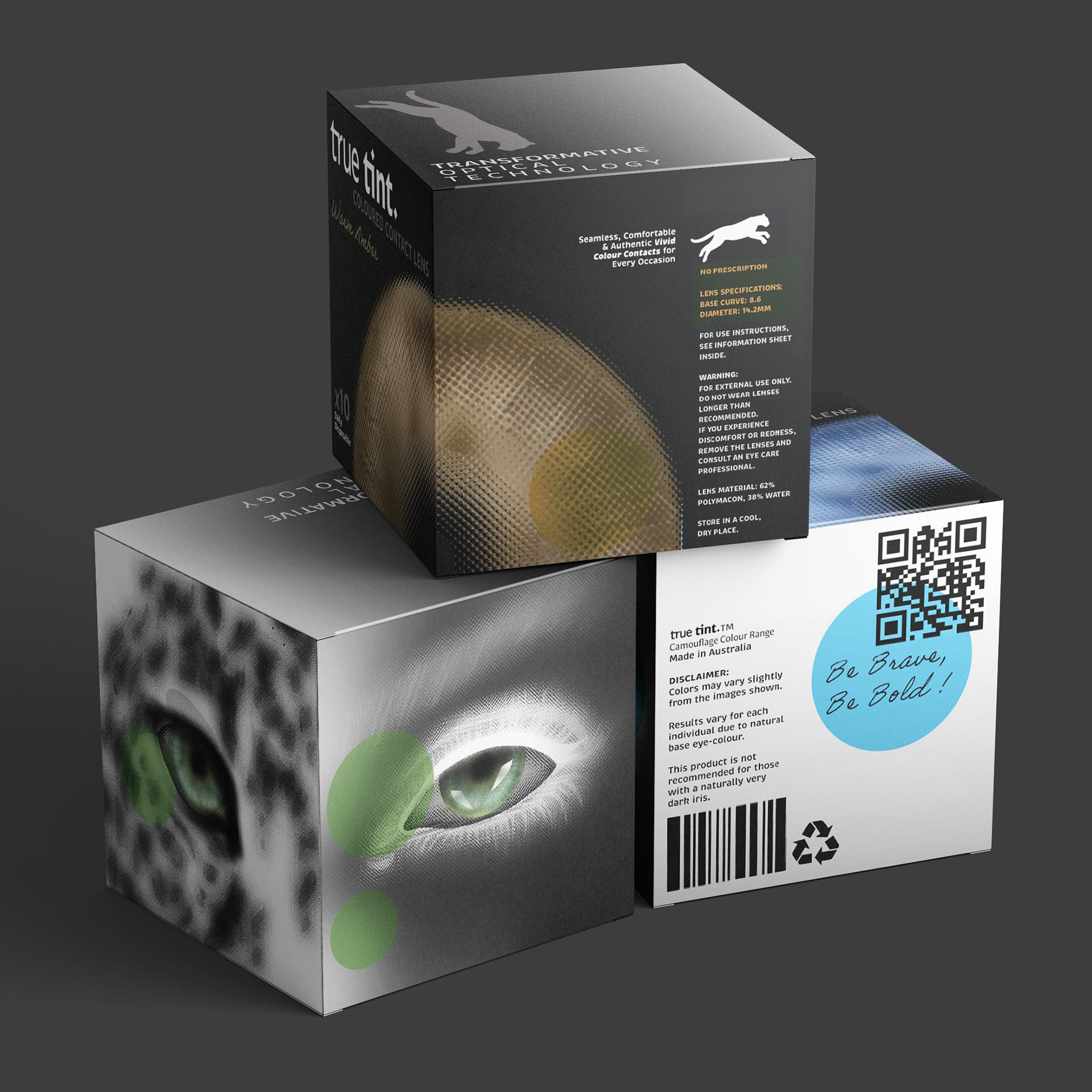
This project involved the creation of True Tint, a boutique brand of coloured contact lenses inspired by the captivating, natural beauty of leopard eyes. The outcome includes a cohesive identity system and a range of three distinct packaging designs using black and white, and spot colours only.
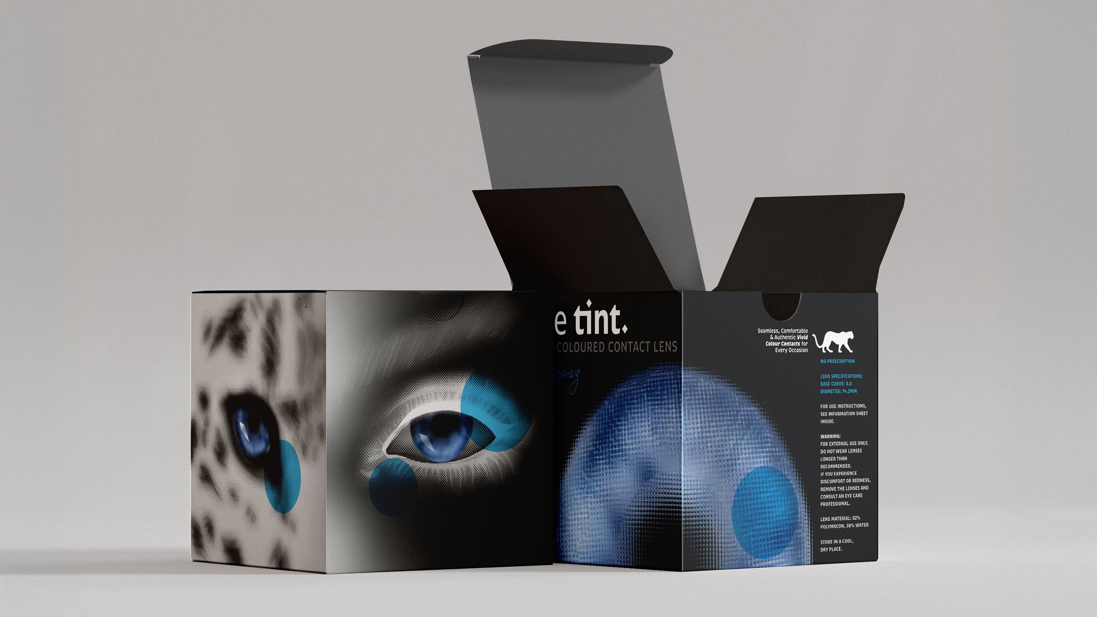
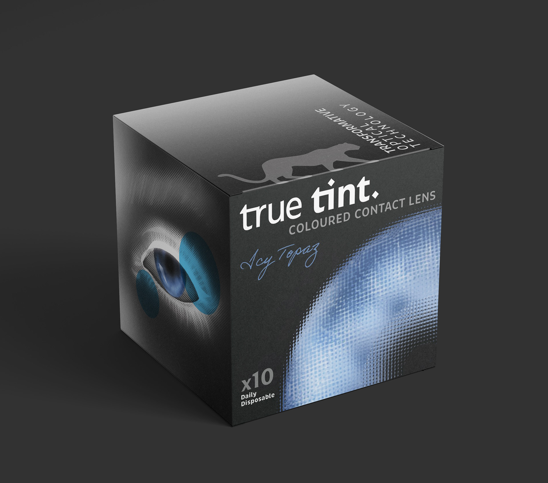
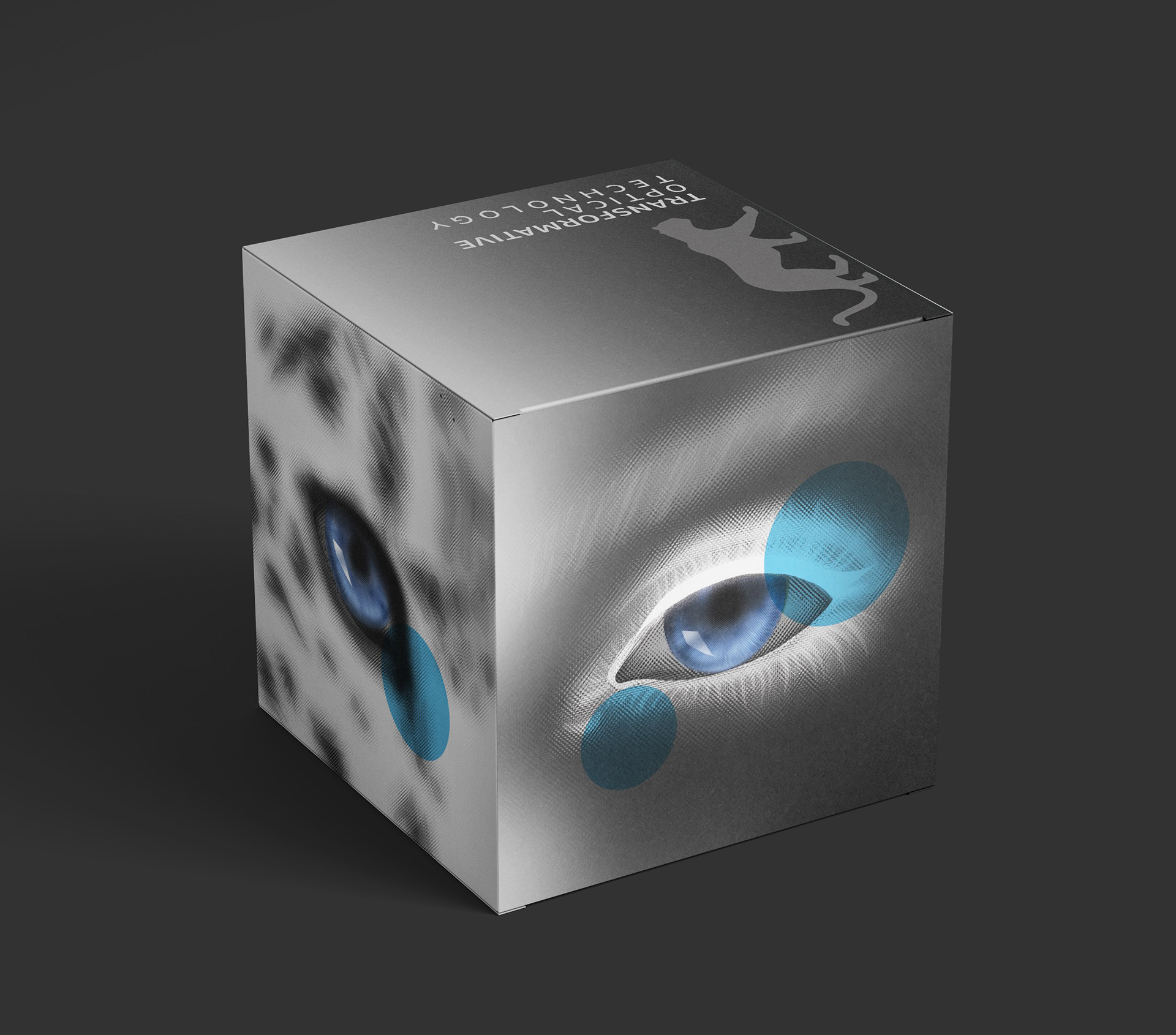
Each box design in the True Tint range balances individuality with brand cohesion, using colour, texture, and visual motifs to reflect the unique allure of each lens variant.
The folded sheet adds practicality to the brand experience.
The folded sheet adds practicality to the brand experience.
This project showcases a blend of strategic branding, experimental image-making, and technical precision in packaging design—tailored for a high-end, visually driven product.
Key deliverables:
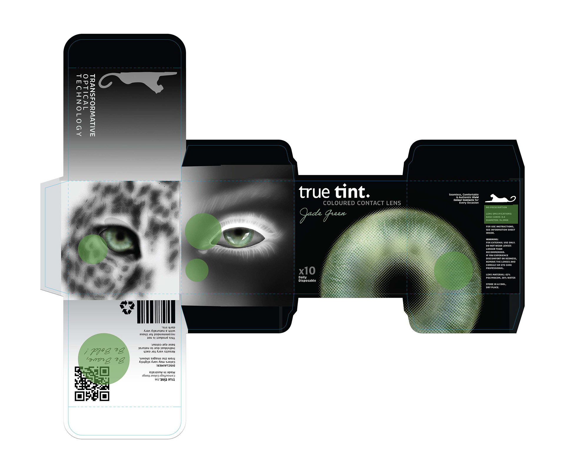
Three CMYK-printed box designs using the supplied dieline, incorporating custom surface graphics, individual colour signatures, and detailed finishing elements
A folded A3 information sheet, designed to include brand storytelling and lens care guidance
Press-ready PDFs for print production